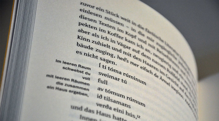
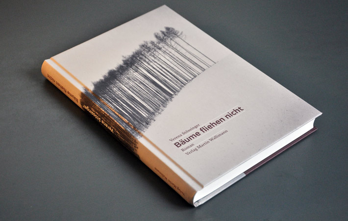
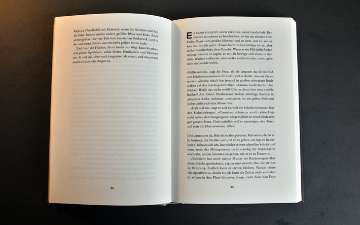
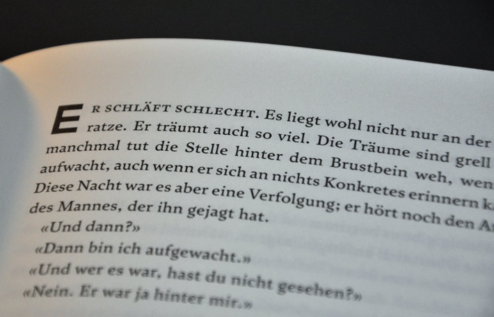
«Bäume fliehen nicht» («Trees Don’t Flee»), a moving, sensitive and multifaceted historical novel by Verena Stössinger, based on an authentic story and historical documentation; I have designed and typeset the book with great care, trying to lend a soft, quiet, subtly warm form to this gentle, but inquiring approach to jarring wartime memories.
Services: book design, cover design, typesetting; contributions to main typeface
Publisher: Verlag Martin Wallimann, Alpnach/Switzerland
192 pages, hardcover
Typefaces: Satyr, Octane (still unpublished – also by Sindre Bremnes)
Cover photograph by Michael Kenna
Published August 2012; second edition Spring 2013
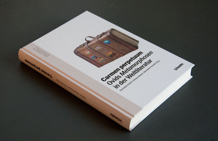
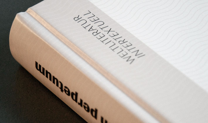
Carmen perpetuum. Ovids Metamorphosen in der Weltliteratur, an academic volume tracing the reception and repercussions of Ovid’s Metamorphoses; edited by Henriette Harich-Schwarzbauer and Alexander Honold of Basel University. I was commissioned to design the cover based on my earlier design of a poster and flyer on the same subject.
Services: book cover design
Publisher: Schwabe Verlag, Basel
328 pages, hardcover
Typeface: Siri
Published early 2013
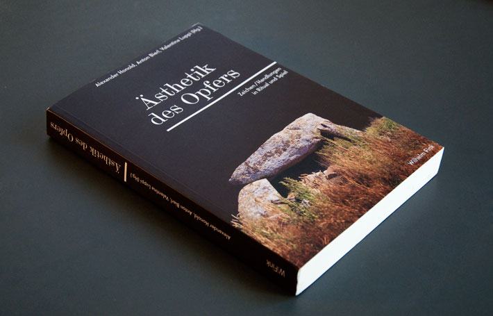
Published earlier this winter: «Ästhetik des Opfers» (Aesthetics of Sacrifice), an academic volume edited by Alexander Honold, Valentina Luppi and Anton Bierl of Basel University. Based on earlier sketches for a poster and flyer on the same subject I was commissioned to also design the cover of the book.
Services: book cover design
Publisher: Wilhelm Fink, Paderborn
316 pages, softcover
Typefaces: Scotch Modern, Telefon
Published late 2012

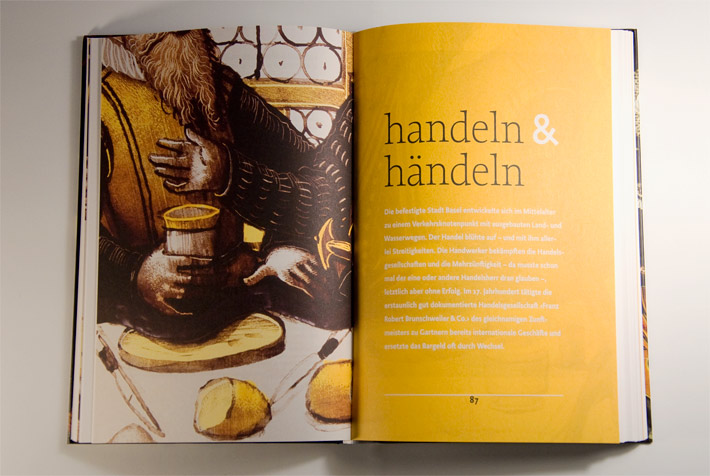
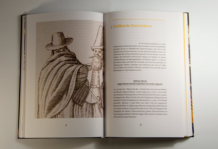
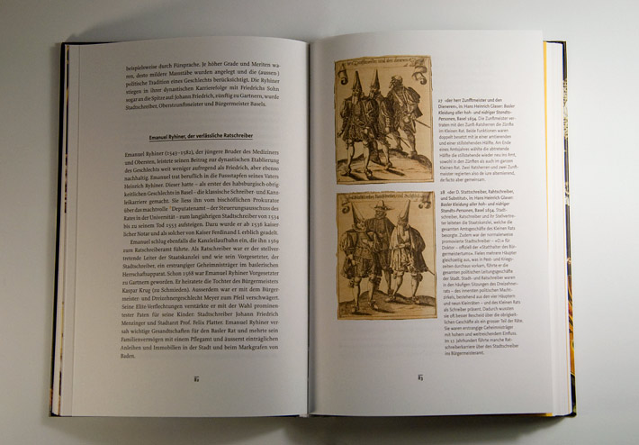
«Zu bürgerlicher Eintracht und Vertraulichkeit» – Ein gartnernzünftiges Geschichtenbuch. This illustrated storybook celebrates the rich and eventful 750-year history of the Basel Gardeners’ Guild; avoiding clichés of dry historical reviews, the book presents a diverse collection of stories – local history seen through the narrative lens of the once quite powerful Guilds. Over 100 images, carefully selected and edited and accompanied by self-contained captions, add background, perspective, or side glances to related questions. (Typo)graphically, it was a great and rewarding challenge to integrate these diverse materials while keeping the layout fresh, but calm and agreeable for reading; despite the rich content, this is not a coffee-table book, but rather a winter-evenings-in-bed kind of book.
Services: book design, cover design, typesetting, image editing
Publisher: Reinhardt, Basel/Switzerland
256 pages, hardcover, illustrated
Typefaces: Proforma, Productus
Published November 2011
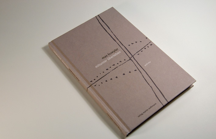
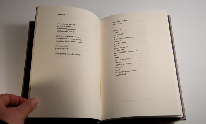
mitunter überleben, poetry (and short prose) by renowned Swiss poet Max Huwyler. It was a joy and an honour for me to design and typeset these succinct and powerful little texts. The cover design is based on a linocut by Lukas Wallimann.
Services: cover design, book design, typesetting
Publisher: Verlag Martin Wallimann, Alpnach/Switzerland
96 pages, hardcover
Typeface: FF Legato
Published November 2011
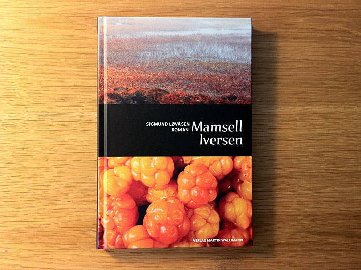
Mamsell Iversen, the German translation of a wonderful novel by young Norwegian writer, Sigmund Løvåsen; a burlesque crime novel set out in the country about a century ago, rough and strong, sometimes brutal, sometimes funny. Recommended!
Services: cover design, book design, typesetting
Publisher: Verlag Martin Wallimann, Alpnach/Switzerland
128 pages, hardcover
Typefaces: TMF Nour&Patria (by Hrant Papazian), FF Balance
Published March 2011
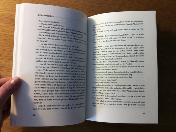
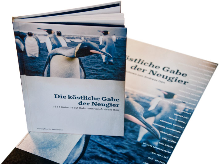
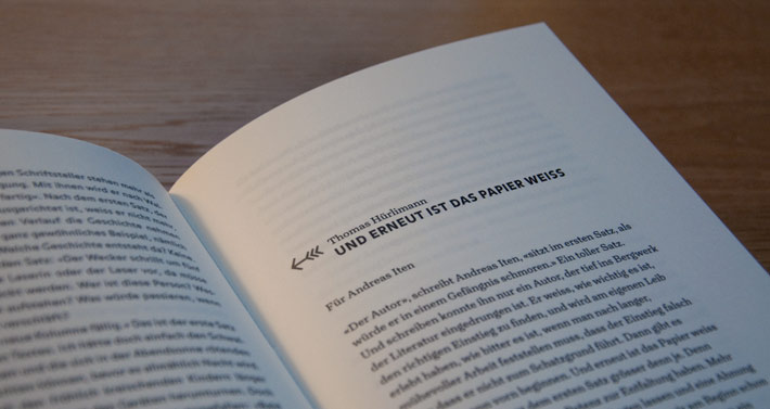
Die köstliche Gabe der Neugier («the delicious gift of curiosity») unites newspaper editorials by Swiss writer/journalist/politician, Andreas Iten, with reactions and «echoes» by his friends and contemporaries. I had much fun designing and typesetting the book, setting the editorials justified in a sansserif while the «echoes» (which in format range from letters and essays to short fiction and even poems) are set in a wider column, ragged right.
Services: cover design, book design, typesetting, image editing
Publisher: Verlag Martin Wallimann, Alpnach/Switzerland
112 pages, hardcover, with b/w illustrations
Typefaces: FF Balance, Turnip (yet unpublished, by David Jonathan Ross)
Published February 2011
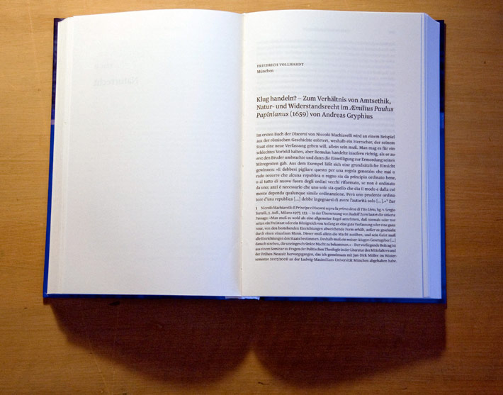
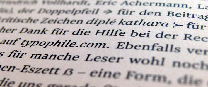
›Natur‹, Naturrecht und Geschichte. Aspekte eines fundamentalen Begründungsdiskurses der Neuzeit. In this weighty academic volume edited by Simone De Angelis, Florian Gelzer and Lucas Marco Gisi, I was allowed to diverge from the publisher's default Times New Roman stylesheet in favor of a beautiful, space-saving, and even historically-correct typeface, to which I added a few more «exotic» characters myself, exclusively for this publication.
Services: book design, typesetting
Publisher: Universitätsverlag Winter, Heidelberg/Germany
522 pages, hardcover
Typeface: Newzald
Published late 2010
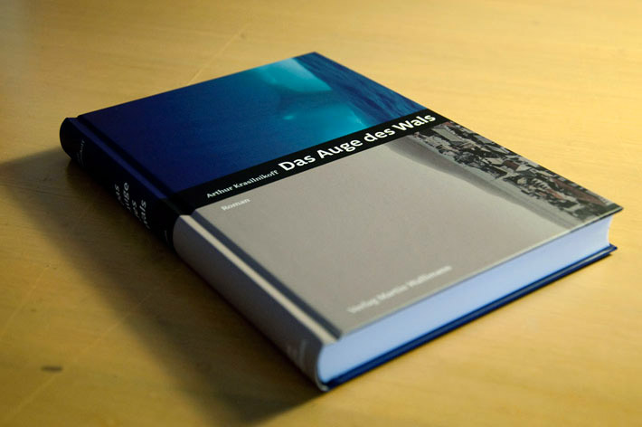
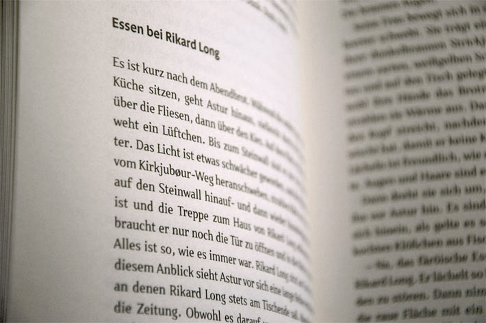
Das Auge des Wals (title translates to «The Eye of the Whale»), a novel by Danish writer Arthur Krasilnikoff, who in 111 fragments tells the tale of a childhood on the remote Faroe Islands in the 1940s, amid sheep, open skies, wind and the wild sea, and the (distant) rumble of war. Warmly recommended.
Services: cover design, book design, typesetting
Publisher: Verlag Martin Wallimann, Alpnach/Switzerland
240 pages, hardcover
Typefaces: TMF Patria (by Hrant Papazian), FF Legato
Published Spring 2010
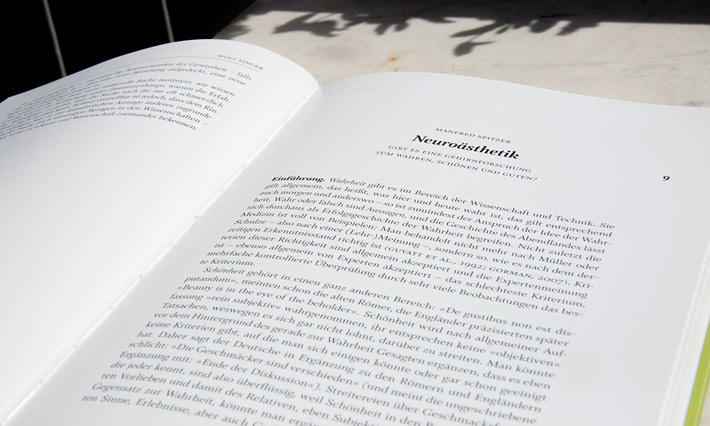
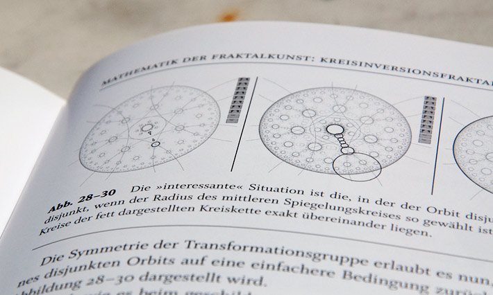
Neuroæsthetics In this scientific volume edited by Martin Dresler, 16 authors examine connections between art, beauty, the brain, and science; themes range from fractal mathematics to the psychology of perception. A very interesting, smart but accessible book.
Services: cover design, book design, typesetting, image editing
Publisher: Seemann-Henschel, Leipzig/Germany
144 pages, hardcover
Typefaces: Whitman, Whitman Display
Published Fall 2009
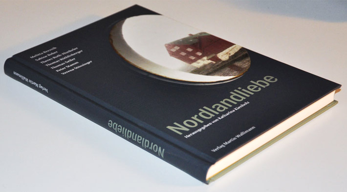
Nordlandliebe This 160-page anthology published by Verlag Martin Wallimann in 2009 documents, dissects, and celebrates eight Swiss writers’ obsession with Scandinavia, with the wind and the rain, the grandeur and the loneliness of the landscapes.
I have designed the book inside and out, and carefully typeset it in Hrant Papazian’s readability-optimized TMF Patria (complemented by the FontBureau’s ITC Franklin), whose «weatherproof» stability and refreshing lack of swirliness seemed great for the job – and happy comments from 86-year-old readers are already coming in.
«a declaration of love in the form of a notedly beautiful book» Neue Zürcher Zeitung
Services: cover design, book design, typesetting, image selection, image editing
Publisher: Verlag Martin Wallimann, Alpnach/Switzerland
160 pages, hardcover, with b/w photographs
Typefaces: TMF Patria (by Hrant Papazian), ITC Franklin
Published Fall 2009
