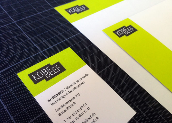
kobebeef: New logo and identity design for Marc Rinderknecht’s Zurich-based web design and development studio, kobebeef. The new identity aims to be fresh and reflect the sophistication, precision, and smartness of Marc’s work across media and formats – with a logo that aims to make you look at least twice, combined with a palette of eight strong, fresh colors. I am responsible for logo and overall identity design as well as office documents and business cards, and consulted with Marc when he redesigned the website. Typefaces: FF Netto, Abril Text.
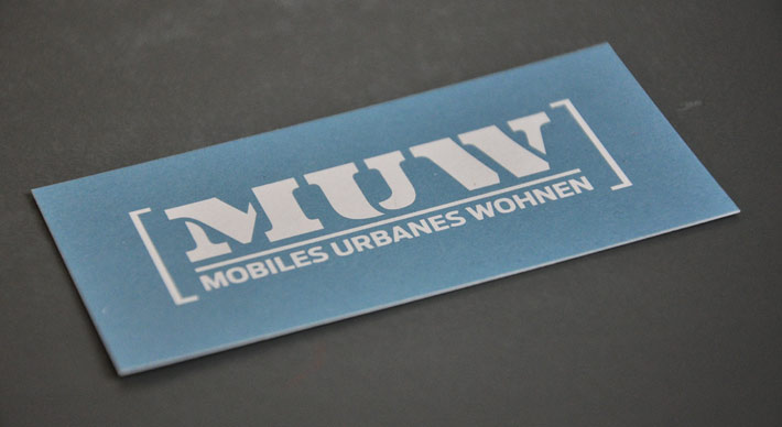
MUW AG: Logo/identity, business card & website for MUW AG («Mobiles Urbanes Wohnen», «Mobile Urban Living»), a Swiss startup specializing in the design and construction of flexible, novel life/work spaces. – Website based on Wordpress and the iA3 Template. Type: Eames Century Modern (logo), Antenna (logo and headings), Benton Modern RE (text).
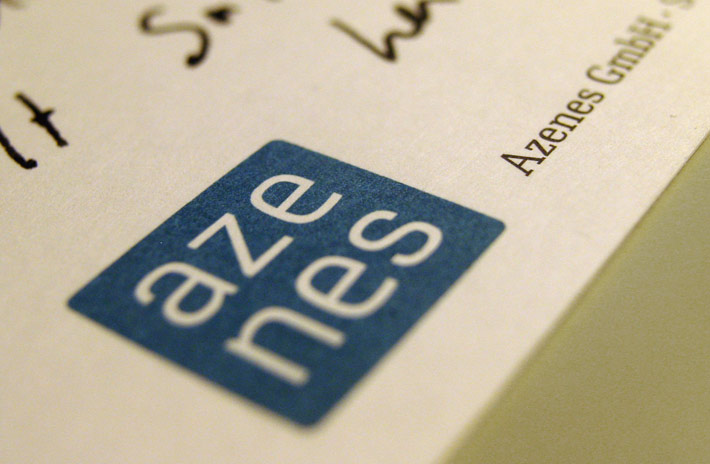
Azenes GmbH: Logo, business card & correspondence card (as well as a small, temporary website) for Azenes GmbH, Actuarial Consulting. The core concept for this wordmark was to achieve a tension-filled balance between trustworthy stability, and potential dynamism; this was achieved by the slight tension in the basic shape, and customized letterforms based on the powerful Breuer Text, combined in printed matter with the ideally matching Ibis Text.
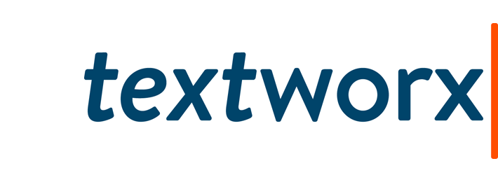
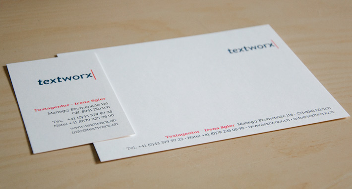
textworx: Along with the new website for Irena Sgier’s text agency, Textworx, we have designed business cards & correspondence cards (below), and adapted document templates to the new visual identity. The wordmark was developed from Brandon Grotesque, which we have paired – both online and in print – with Giza RE .

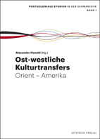
German Postcolonial Studies: Graphical identity for a series of academic publications titled «Postkoloniale Studien in der Germanistik» (Postcolonial Studies in German Literature) for German publishing house Aisthesis. The initiating research network was looking for a flexible «logo» to mark their activities as well as publications. My design solution is focused on a scalable, malleable ribbon-shaped element, which in a continuous «timeline» visualizes – in the words of my clients – the sudden «prismatic breakup of national heraldics», the crossover from rigid domination by a colonial force to a rich, if sometimes confused cacophony of hues and voices. The element can be scaled, shortened, lengthened and twisted according to context. In this first application, my template for the series book covers, the ribbon element takes a prominent role in identifying the series, with the rest of the cover design kept rather simple, with strong typography that however doesn't necessarily take sides culturally (Fonts: Graphik).

Infosperber: The new Swiss independent news platform, infosperber.ch, was officially launched March 29, 2011. Infosperber is a project of the Stiftung zur Förderung unabhängiger Information (roughly: Foundation for the Advancement of Independent Information) spearheaded by Swiss publicist, Urs P. Gasche. I was trusted with the design of the logo / wordmark, which had to be neutral, simple and classical, but highly memorable; dynamic but controlled. Background / Case Study
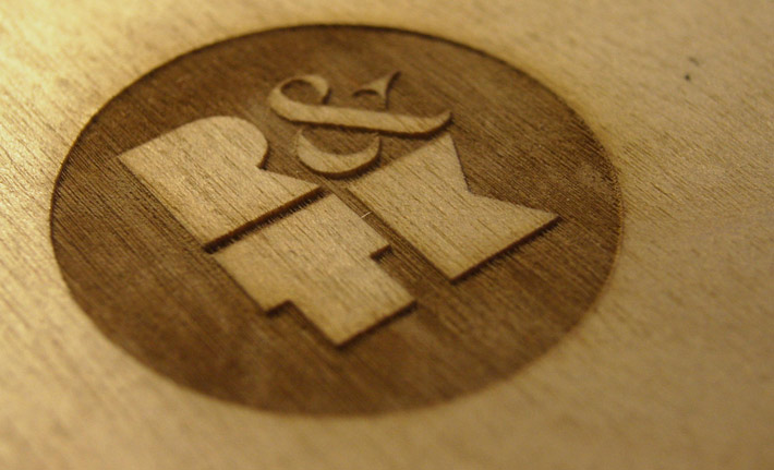
Rainer & Tobias Kyburz Logo designed for Rainer and Tobias Kyburz, young Basel-based furniture and product designers. The logomark («R&TK») is also used on its own to mark objects, products and furniture (which is why we have focused on developing a strong graphical mark that does not need to rely on color). The fat initials were drawn by myself, the ampersand is slightly tweaked from Dala Floda from Commercial Type. The wordmark is set in Supria Sans, also used for various printed matter and correspondence.
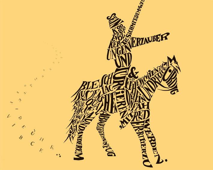
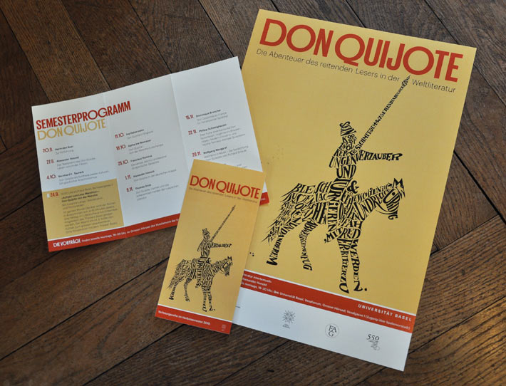
Don Quijote Posters and program flyers for a University of Basel lecture series. For this deeply (and self-reflexively) fictional, book-obsessed persona that creates itself from the literature he reads, I found it quite fitting to actually recreate his image by way of letters, of the text itself.
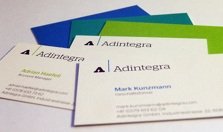
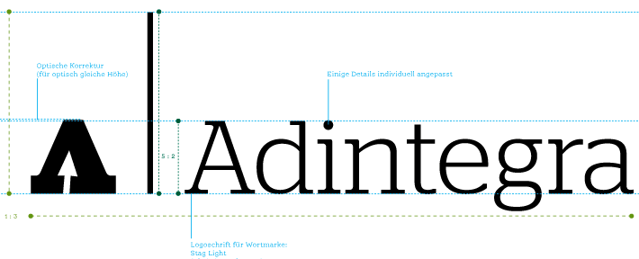
Adintegra Logo & business cards for these young Swiss IT consultants. They were looking for something serious, simple and calm, but not boring or exchangeable. While the basic layout has been kept classical in a friendly no-nonsense sort of way, three different colors from a blue/green spectrum, entirely covering the verso of the cards, bring the right amount of freshness to the cards.
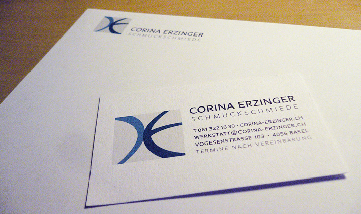
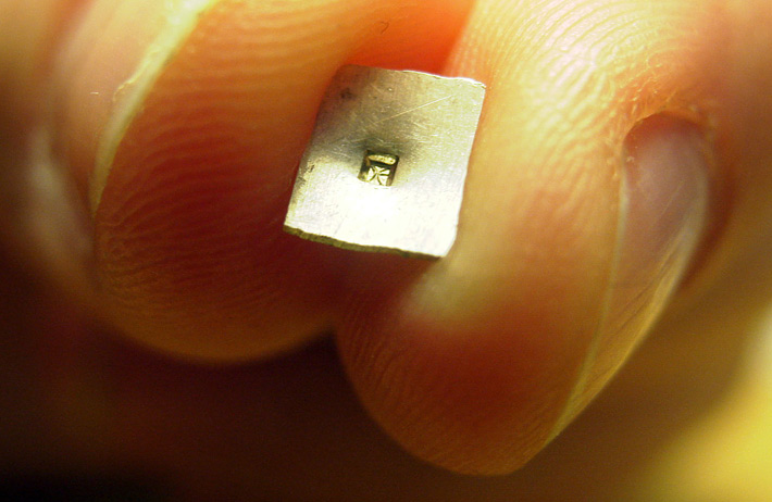
Corina Erzinger Logo, business card and letterhead for Basel-based jewelry designer Corina Erzinger. Starting from Corina’s own pencil sketches, I have refined the logo, worked out the typographic concept, advised her on licensing correspondence fonts, and designed a letterhead and business card – as well as an incredibly small version of the logo for Corina’s jewelry punch (shown below is a sample impression in soft metal): its face is 0.75mm tall, less than three points.
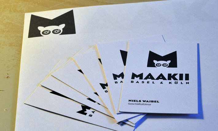
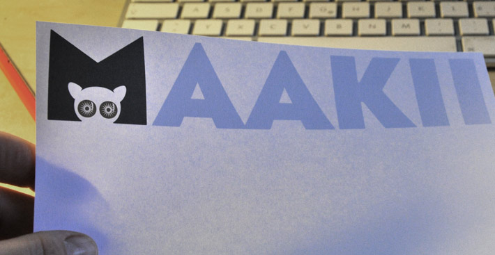
Maakii Makis are animals with very big eyes, which excel at communicating and know their way around the media jungle. For the Basel- and Cologne-based media production company Maakii I developed this fresh identity that aims to be simple but surprising.
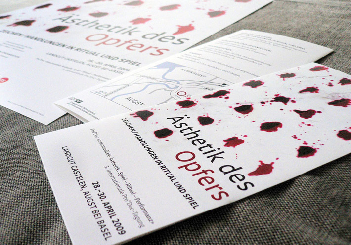
Aesthetics of Sacrifice Some of my favorite assignments are posters and program flyers for conferences dealing with complex subjects. This one was about patterns, forms, functions and aesthetics of sacrificial rituals. Raster design with blood (OK, beet juice)! Some more pictures and a full making-of (in German) on my blog.
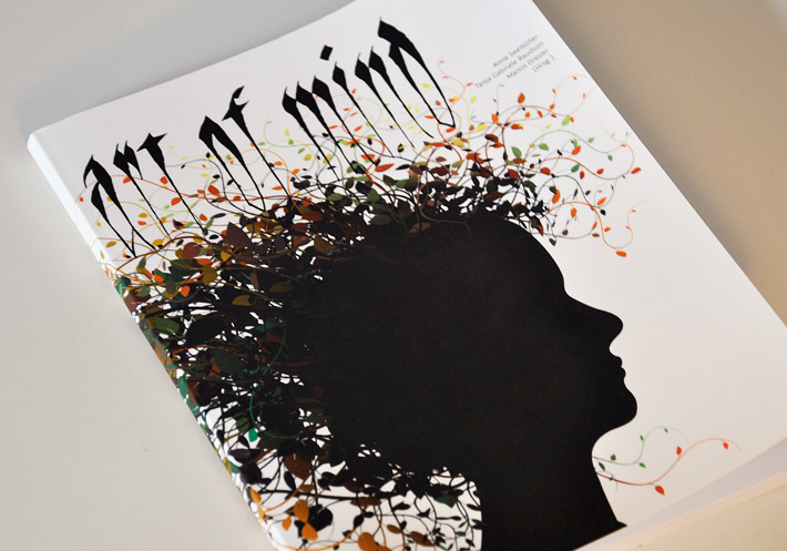
Art of Mind Cover for a little art catalog published by German Mensa.
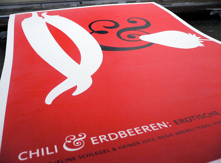
Chilli & Strawberries Silkscreened collectible poster for an engaging evening of erotic stories told by local Erzähltheater Salaam. The brief was: more wit than sleaze, and no b/w stock photography of nude people. And then the program had this great name!
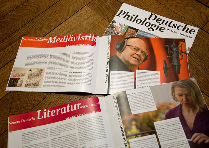
German Studies in Basel
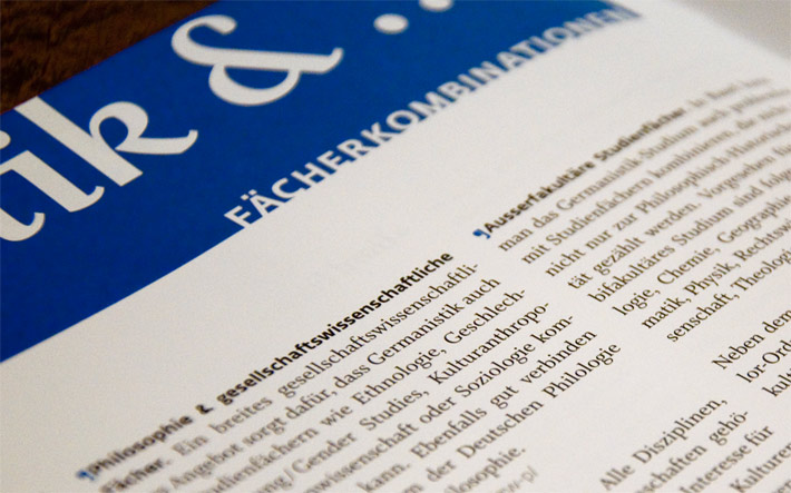
Friendly and fresh, but not cosying up too much; colorful, but not too loud; accessible but intelligent: That is how the German Department of the University of Basel presents itself in this 24-page full-color information brochure. Targeting prospective, potentially interested students, the brochure doesn't just explain practical details about the course of study, but also presents successful alumni in short interviews.
I have designed and typeset the brochure as well as contributed some of the photography; portrait photography is almost exclusively by my colleague Philipp Suter.