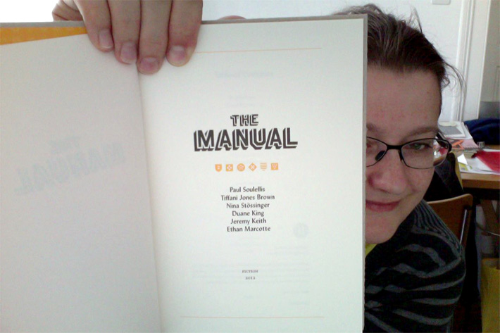
The Manual Issue #3 of the beautiful and thoughtful webdesign journal «The Manual» («beautifully chronicles the maturing of design on the web. It will change how you think about your work») to which I was invited to contribute; my essay, «Deeper Into Type», is an invitation into the thicket of typography, a call to web designers to really stop and smell the serifs... I truly am happy and honored to be part of this wonderful little book published by Andy McMillan and edited by Carolyn Wood, working with whom was a great joy.
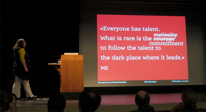
My talk, «The Importance of Being Ernestine», at TYPO Berlin 2012 «sustain».
Photo: Roland Stieger
Presentations on FF Ernestine
I have been happy to present my typeface, FF Ernestine, and the process that led to its creation, in a few public talks so far:
– Type design presentation at tgm, 20 March 2012, Munich (Review [German])
– Tag der Schrift 2012, 12 May 2012, Zürich (Official Report [German])
– TYPO Berlin 2012 «sustain», 17–19 May 2012, Berlin (TYPO Blog [German])
Type Review: Supria Sans. Within Typographica’s legendary series «Favorite Typefaces of 2011», thankfully resurrected after a two-year hiatus, I was among those invited to pick and review my favorite typeface of the past year. In what is officially my first published typeface review, it was an honor, a challenge, and a great joy to present a fresh, characterful, and surprisingly versatile sansserif that I've had the pleasure of working with myself this past year – Hannes von Döhren’s Supria Sans. (January 2012)
Essay published at typografie.info: Die armenische Schrift – im Bann des »Aybuben« [German], essay about the Armenian alphabet and the backgrounds of our Armenotype project, published May 3, 2011 at the German-language typography site typografie.info
MinD Symposium: April 8, 2011, Passau/Germany
«Sprache wird durch Schrift erst schön».
Relevance and Relativity of the Aesthetics of Letterforms
«People who love ideas must have a love of words», as Beatrice Warde wrote, and «given a chance they will take a vivid interest in the clothes which words wear.» Coming from a practical background and peppered with glimpses into related fields such as type history or readability research, this talk (in German), aimed at an audience of interested typographic laypersons, takes a closer look at these «clothes» – the areas of black and white that we recognize as letters and decode to text.
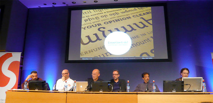
Panel featuring (left to right) Hrant Papazian, André Baldinger, Erik Spiekermann, Martin Majoor, David Berlow and me. Photo: Roland Stieger
ATypI Dublin: It was a wonderful experience to attend the 2010 ATypI Conference as a speaker for the first time. Within a panel discussion nicely titled «Managing Multiplicity: The Pitfalls and Pleasures of Collaborative Typeface Design», I had the chance to cast a light on collaborative type design from a novice’s perspective, as well as present my own typeface that I have been working out together with Hrant Papazian. Furthermore, inspiring and often surprising new input and enjoyable get-togethers with friends old and new made the days in Dublin an unforgettable, rich experience.
FontFeed article | Flickr pool with many photos
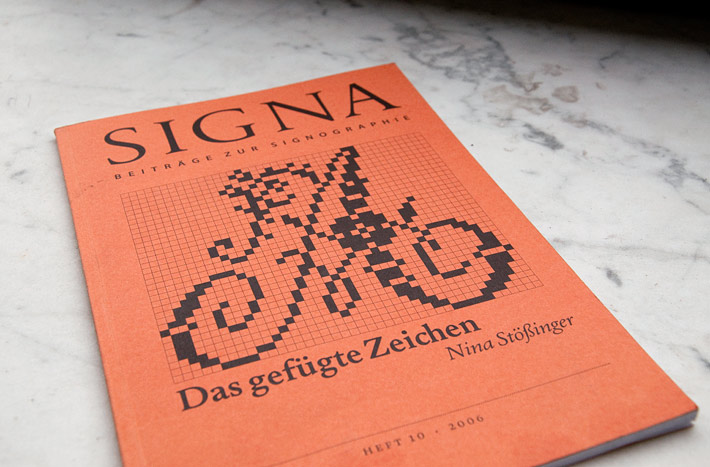
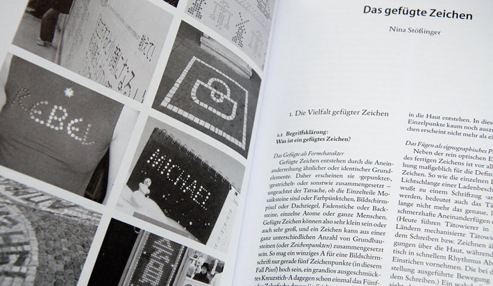
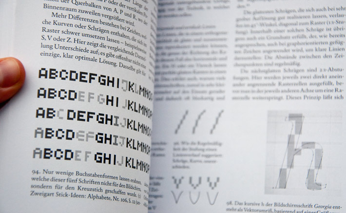
Das gefügte Zeichen Over the course of about two years, I somewhat obsessedly collected, sorted and researched a formal category of signs for which I'm still trying to come up with a good English term – in German, the signographer Andreas Stötzner and I have named them «gefügte Zeichen», something like compound signs perhaps. We are referring to graphical markings that are not written, printed or formed out of some material, but rather composed from a multitude of smaller discrete elements. It is a formal principle that can be observed on tiled roofs as well as in cross stitch samplers, in antique mosaics as well as pixels on today's screens. I was curious why this principle is applied, what advantages it has and where its pitfalls lie; and mostly I tried to isolate formal «rules» governing the design of these composed signs, and observe how this particular design constraint has been dealt with across vastly different media and contexts and across the ages.
The (intermediate) results of my research in this area have been published as the 10th issue of the German-language SIGNA journal under the title «Das gefügte Zeichen» (2006).